Adding data visualizations to agent responses
AI agents built with the Agent Designer can display charts and graphs in their responses, styled to match Boomi's user interface design. Agents can automatically determine and select the most suitable visualization for the data. These visualizations are built-in, meaning they don't rely on external tools or services. However, you can also instruct the agent to use specific visualizations for particular data.
Native chart generation makes it simple for agents to turn data into visuals as part of the conversation. However, you have the flexibility to use your own visualization service if you prefer. If you choose this option, you can create an API tool, which you'll need to attach to the agent's instruction so the agent can call the API.
When creating agent tasks and instructions, it is important to indicate that the agent needs to generate a data visualization.
You cannot alter the chart style and colors.
Agent example
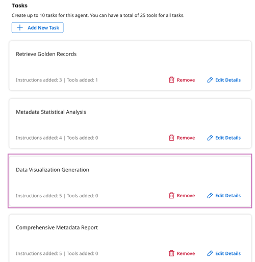
The following example shows a task and instructions that include chart generation and the agent’s output. In this example, the agent pulls golden records from Data Hub and adds charts to visualize metadata statistics.
Data Visualization Generation is a separate task the agent must perform to achieve its goal of generating a metadata report. The task includes a general description indicating that the agent must create charts and graphs to represent the metadata insights. Note that the visualization task does not require any special tools because this functionality is native to the AI agent.
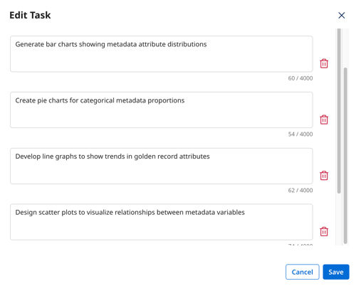
Several instructions in the task indicate specific charts and graphs that must be included in the report. Although specifying particular visualizations is optional, doing so often leads to more predictable and desirable results, especially when indicating the specific data analysis you want to accompany the chart. For example, you may want the agent to analyze the distribution of countries and represent this data in a donut chart.
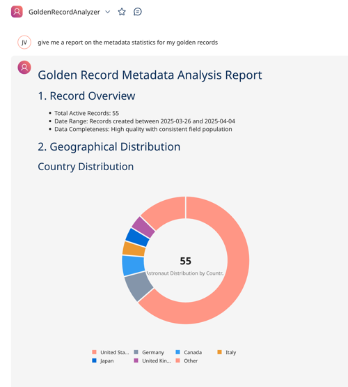
When testing the agent in the Test agent window, the agent produces a summary report that includes visualizations.
Supported visualizations
Agent Designer supports the following data visualizations:
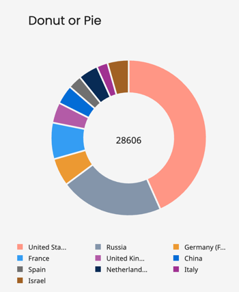
Donut/ Pie
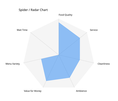
Spider/Radar chart
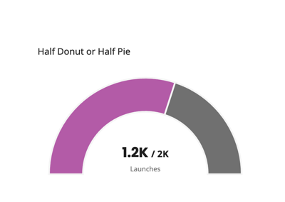
Half Donut or Half Pie
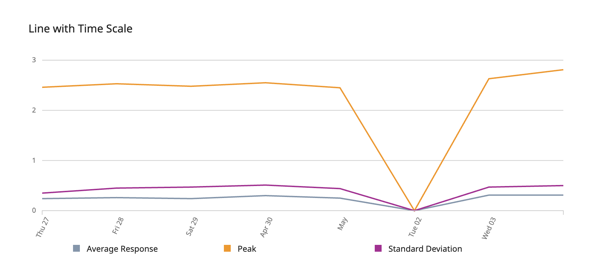
Line chart with time
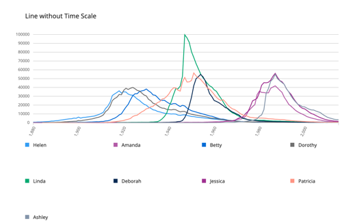
Line chart without time
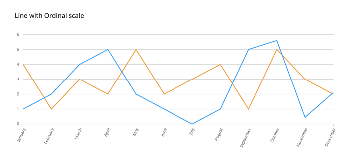
Line with Ordinal scale
Multi Area chart
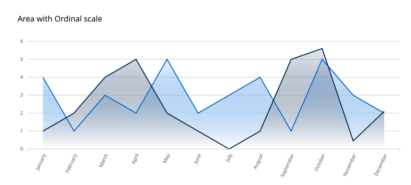
Area with Ordinal
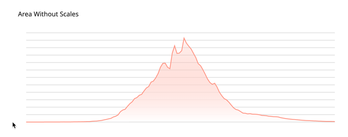
Area without scales
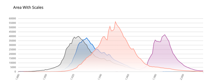
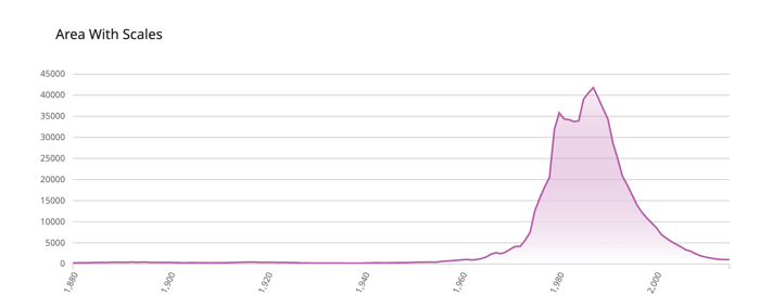
Area with scales
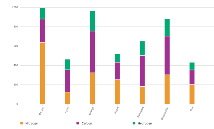
Stack bar
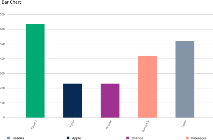
Bar chart
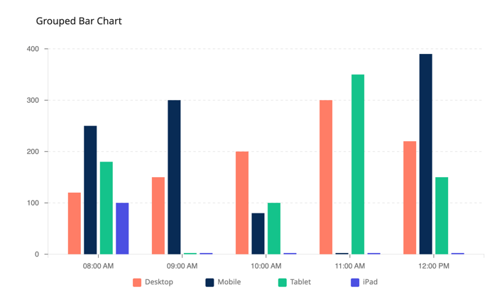
Grouped bar chart