Containers
Add containers to a page to form the page structure, and group components together.
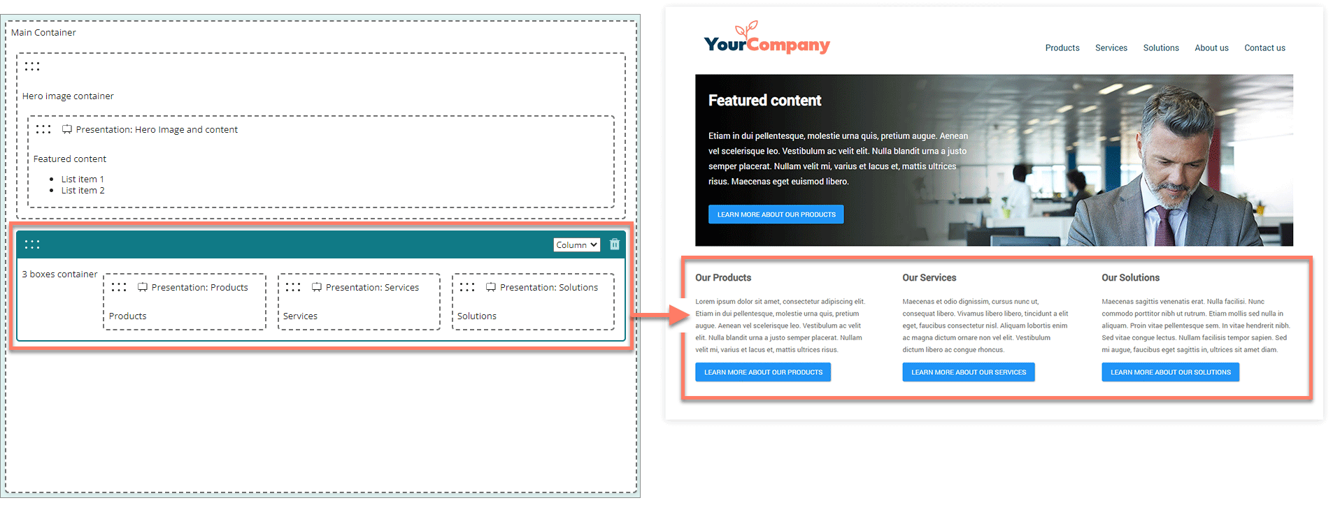
Containers act as placeholders for content in a page. You can combine multiple containers in a page to build the exact page layout that you require. Add components into containers to define the actual content displayed on the page.
-
All content on a page is contained within a "main" parent container.
-
Choose how a container and its contents are displayed on a page by changing the container layout type. For example, containers can display content on a page in horizontal rows, or as columns. Refer to Container layout types.
-
You can nest containers within other containers, which can also contain any mix of containers and components. This allows you to build complex page layouts by combining multiple container types and components.
-
Apply additional CSS styling to containers by entering space-delimited CSS classes into the CSS Classes field.
Adding a container
To add a container to the page:
-
From the Containers section of the Components menu, drag-and-drop a container onto the page where you would like to position it.
-
Configure the container options and settings as required.
- The container layout menu is shown in the top-right of the container header.
Moving a container
To move a container on the page:
- You can drag and drop any component from the list of components to a new position on the page.
Editing a container
To edit an existing container:
-
Click anywhere on a container to select it.
-
The container is highlighted with a blue solid border.
-
The container layout menu is shown in the top-right of the container header. Change the container layout type as required. Refer to Container layout types.
-
Configure the container options and settings in the configuration panel.
-
Deleting a container
To delete a container:
- Click anywhere on a container to select it.
- Click the Delete icon located in the top-right of the container header.
- Click Delete on the Delete selected component dialog. The container is removed from the page, along with any nested containers and components within.
Default player runtime
You can customize page containers by applying attributes. All containers share the same common set of attributes, relating to collapse/expand behaviour. You can apply the following attributes when running flows with the default player.
| Key | Value | Description |
|---|---|---|
isCollapsible | boolean | Controls the collapse/expand toggle behaviour for a container. • true: Enables collapse/expand toggle behaviour for the component, overriding the default false setting.• false: Set by default, disables collapse/expand toggle behaviour for the component.A Label must be entered for the container otherwise the toggle icon is not displayed. |
isCollapsed | boolean | If the container has been set as collapsible, this attribute defines the initial state of the container. • true: The container is initially displayed in a collapsed state.• false: Set by default, the container is initially displayed in an expanded state. |