Components
Add components to display content and provide features in a page.
components are reusable, customizable elements that you can add to a page to provide common web interface features and functionality.
For example:
-
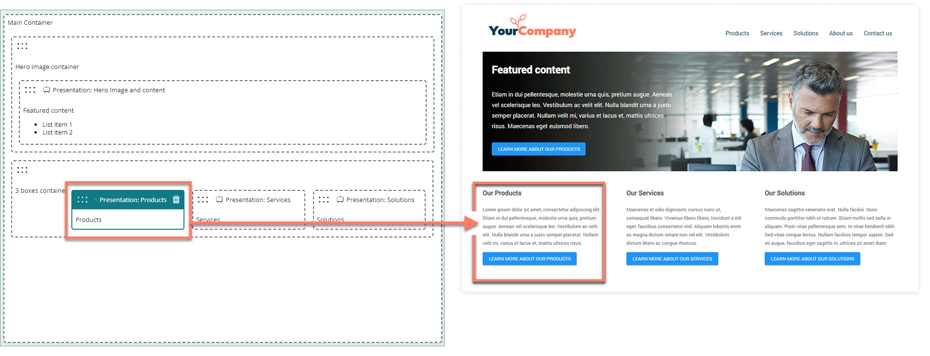
Add presentation components to present rich-text and multimedia content.
-
Add table components to present data as interactive tables, using data from connectors and data sources.
-
Add input components to enable user input features, and allow users to interact with a page.
Standard components
Flow comes with a set of standard pre-built components.
You can add standard components from the page builder Components menu.
-
Content components: Display content on a page, such as rich text, images and multimedia.
-
Input components: Add form feature such as input fields, radio buttons, and checkboxes into a page, to allow user input in a Flow.
-
Data components: Display interactive data on a page, and allow your Flow users to interact with files.
Custom components
If you require a user interface feature not provided by the standard components, you can build a custom component instead, and add it to a page just like a standard component.
You can add custom components from the Custom section of the page builder Components menu. This section is not shown if there are no custom components installed in the tenant. Refer to Components.
Adding a component
To add a component to a page:
- From the Components menu, drag-and-drop a component onto the page where you would like to position it.
- Configure the component options and settings in the configuration panel.
Moving a component
To move a component on a page:
- You can drag and drop any component from the list of components to a new position on the page.
Editing a component
To edit an existing component:
-
Click anywhere on a component to select it.
-
The component is highlighted with a blue solid border.
-
Configure the component options and settings in the configuration panel.
-
Deleting a component
To delete a component:
- Click anywhere on a component to select it.
- Click the Delete icon located in the top-right of the component header.
- Click Delete on the Delete selected component dialog. The component is removed from the page.
