Add a custom component
The content on this page is outdated and will not receive updates. For the most up-to-date feature, refer to Setting up and managing flows.
Add a custom component to your tenant to make it available in the page builder.
Prerequisites
- You have a Boomi Flow account and can access the Flow interface.
- You have the custom component package (JavaScript bundle and optional CSS) to install.
Overview
Custom components are added and managed on the Components page.
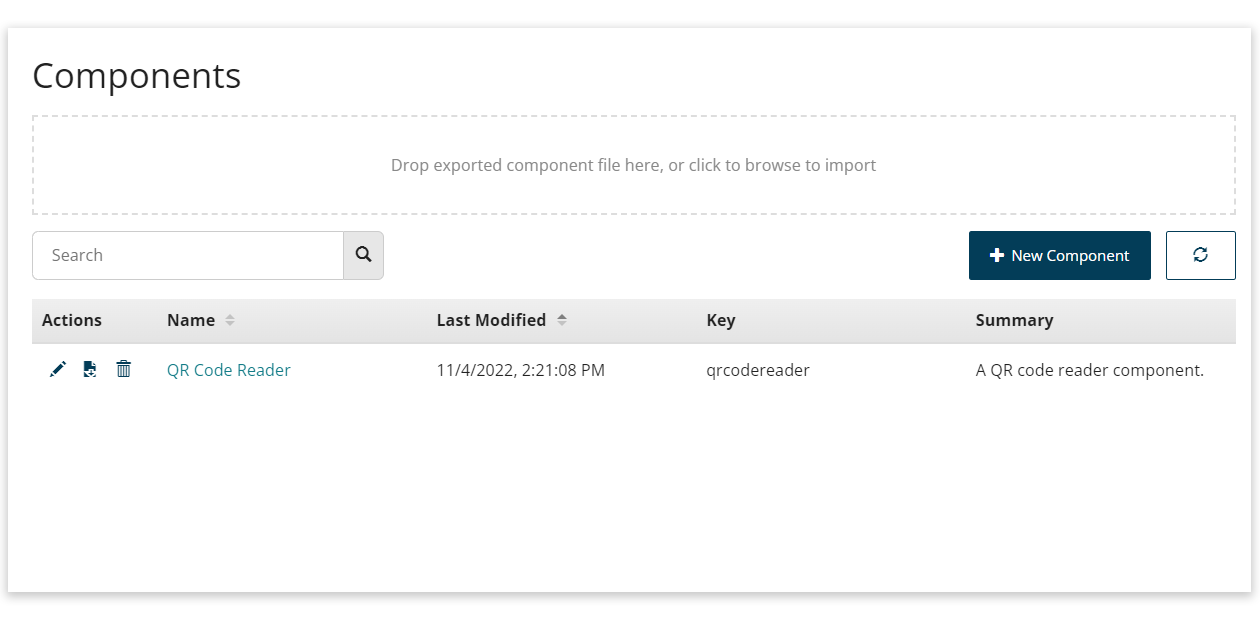
To open the Components page, select Components from the main left-hand menu.
On this page, you can:
-
Add a new custom component to your tenant.
-
Import a previously exported custom component. Refer to Export and import custom components.
-
Edit, export, and delete existing custom components.
Add a custom component
To add a custom component:
-
Open the Components page.
-
Select New Component.
-
Name: Enter a name for the new component.
-
Key: Enter the unique component registry key for the component. This value must be in lowercase.
The key must match the key used in the component JS for registering with the framework using
manywho.component.register. The key can match any of name or alias.For example, a valid key could be any of
signature-pad,SignaturePad, orsignature_pad, for a component that uses:const SignaturePad = (props) => {...};
manywho.component.register("signature-pad", SignaturePad,[ "signaturepad", "signature_pad"])To learn more about registering components with the legacy runtime, refer to the developer documentation at Register a React component.
-
Description: Enter a description for the component.
-
Legacy Runtime options: Upload the component file(s), consisting of a JS file (.js), and optionally a CSS file (.css).
Expand the Legacy runtime options accordion to show the options.
-
Legacy JS: Select the Upload JS icon to upload a file into, or select an existing file from, your asset library. You can also enter a URL to a hosted custom component JS file (this can be hosted locally to help local development).
-
Legacy CSS: Select the Upload CSS icon to upload a file into, or select an existing file from, your asset library. You can also enter a URL to a hosted custom component CSS file (this can be hosted locally to help local development).
-
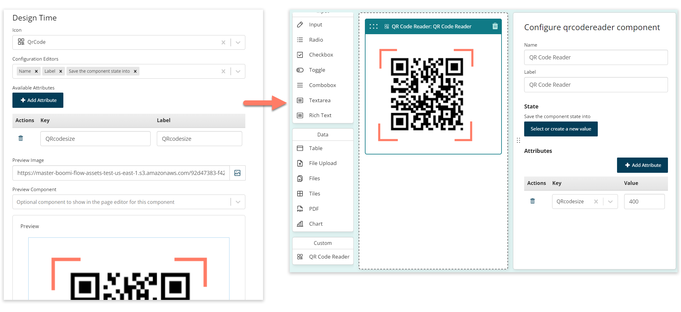
Design Time: Define how the component appears in the page builder, and which configuration options are available.
-
Icon: Select the icon to use for the component in the page builder.
-
Configuration Editors: Select the configuration options to make available in the page builder for the component.
-
Available Attributes: Define any attributes that can be selected and applied to the component. The attributes you add here become available for selection on the component in the page builder.
-
Preview Image: Optionally specify an image to show for the component in the page builder. Select the Upload Image icon to upload an image file into, or select an existing image file from, your asset library. You can also enter a URL to a hosted image file (this can be locally hosted).
-
Preview Component: Instead of specifying an image to show for the component in the page builder, you can have the component present as an existing component.
-
Preview: Shows how the component will be displayed in the page builder, using the preview image/component selections you have made.
-
-
Click Save Component to save and add the custom component into your tenant.
-
You are returned to the Components page.
-
The new custom component is shown in the table of custom components.
-
Edit the custom component by selecting either the Edit icon in the Actions column, or the link in the Name column.
-
Export the custom component by selecting the Export icon in the Actions column. Refer to Export and import custom components.
-
Delete the custom component from the tenant by selecting the Delete icon in the Actions column.
-
The custom component becomes available to use in the page builder. Refer to Use a custom component in a page.
-
