Container attributes
The content on this page is outdated and will not receive updates. For the most up-to-date feature, refer to Setting up and managing flows.
You can customize page containers by applying attributes.
All containers share the same common set of attributes, relating to collapse/expand behaviour.
Default legacy player runtime
You can apply the following attributes when running flows with the default legacy player.
| Key | Value | Description |
|---|---|---|
isCollapsiblePage builder: Can a container be collapsed | boolean | Controls the collapse/expand toggle behaviour for a container. • true: Enables collapse/expand toggle behaviour for the component, overriding the default false setting.• false: Set by default, disables collapse/expand toggle behaviour for the component.A Label must be entered for the container otherwise the toggle icon is not displayed. |
isCollapsedPage builder: Is a container collapsed | boolean | If the container has been set as collapsible, this attribute defines the initial state of the container. • true: The container is initially displayed in a collapsed state.• false: Set by default, the container is initially displayed in an expanded state. |
collapseGroupPage builder: Name of the container collapse group | string | Set the value to the name of the group that the container belongs to. All containers in the same group share the same collapsed/expanded state. |
Metadata example
This metadata example uses the default legacy player runtime.
"attributes": {
  "isCollapsible": false,
  "isCollapsed": false,
  "collapseGroup": "my group",
}
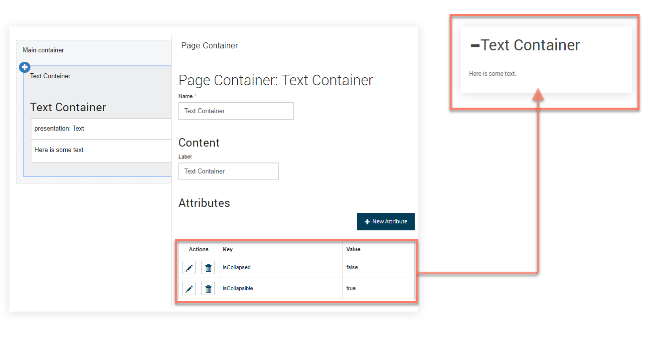
A worked example - using the 'isCollapsible' attribute
This worked example uses the default legacy player runtime.
-
The
isCollapsibleattribute is added and set to "true" on a "Text Container" page container. -
The
isCollapsedattribute is also added and set to "false". -
When the Flow is published, the container is shown in an expanded state to begin with. A toggle icon next to the label allows the container (and the content within) to be collapsed/expanded by the user.